UX DESIGNER
Forward Flux Productions: Live Art & Experiences
Building a foundation beyond the theatre community
The Problem
I was part of a three person UX design team who worked with a live arts production company called Forward Flux. The heart of their work lies in their desire to create a space for community and conversation. Our goal was the help users learn about Forward Flux and drawn in new users outside of the theatre community.
The Solution
Our solution was to improve the Information Architecture of the website, strengthen the global navigation, and investigate visual design that more appropriately aligned with the identity of Forward Flux. Users needed to be able to quickly find information in order to build trust and purchase tickets to Forward Flux events.
My Role
User Interviews
Contextual Inquiry
Persona
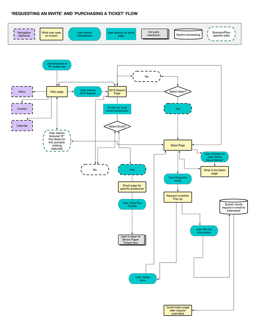
Scenarios/User Flows/User Stories
Sketches/Wireframes
Prototyping in Axure
Visual Design
Spec Documentation
Tools Used
Paper & Pencil
Omnigraffle
Axure
Photoshop
Illustrator
InDesign
Uncovering the Business Goals
Our team met with Forward Flux's stakeholder, Wesley Frugé, to determine what problem he needed solved to help grow his business. Our take aways from this stakeholder interview were:
- Cleaning up the Forward Flux mobile site
- Integrating social media
- Reaching a new audience beyond theatre enthusiast
What The Users Needed
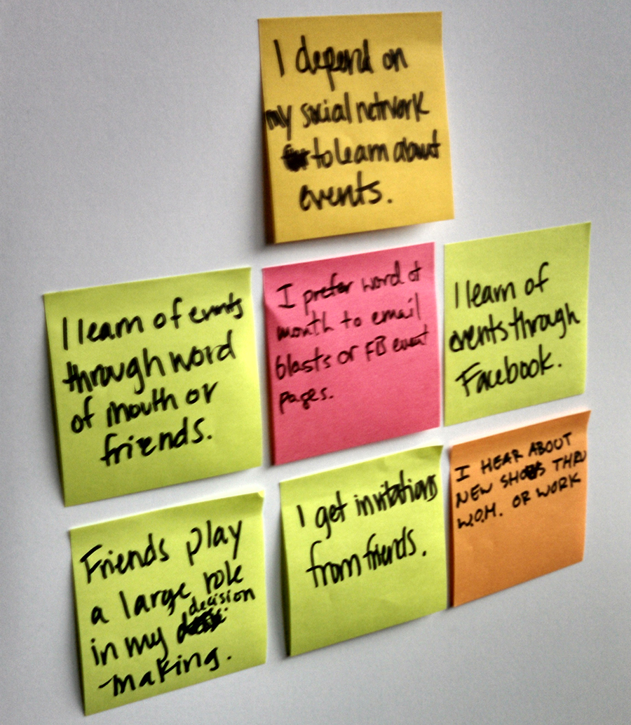
After sitting down with users that regularly attended live arts performances and conducting contextual inquries, we learned the users needed:
- To collect their information quickly and efficiently
- The highest level of trust was through word of mouth recommendations by other friends
- The current Forward Flux site had poor IA, resulting in minimal trust from the user
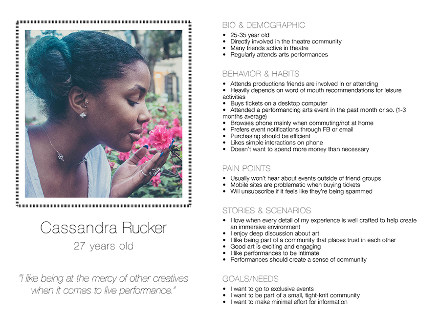
Here we were able to develop our persona, Cassandra.
Investigating the Current Site
We developed a statement of work to share with our stakeholder outlining the information we collected from our stakeholder and user interviews. Our team then did a more in-depth investigation of the existing site's content structure. This process involved:
- Card Sorting Exercises
- Revising and condensing the global navigation
- Streamlining tasks in the workflow, like requesting tickets
- Developing Sitemap of current mobile site
With a strengthened IA and global navigation, we moved to the design phase to test our solution.
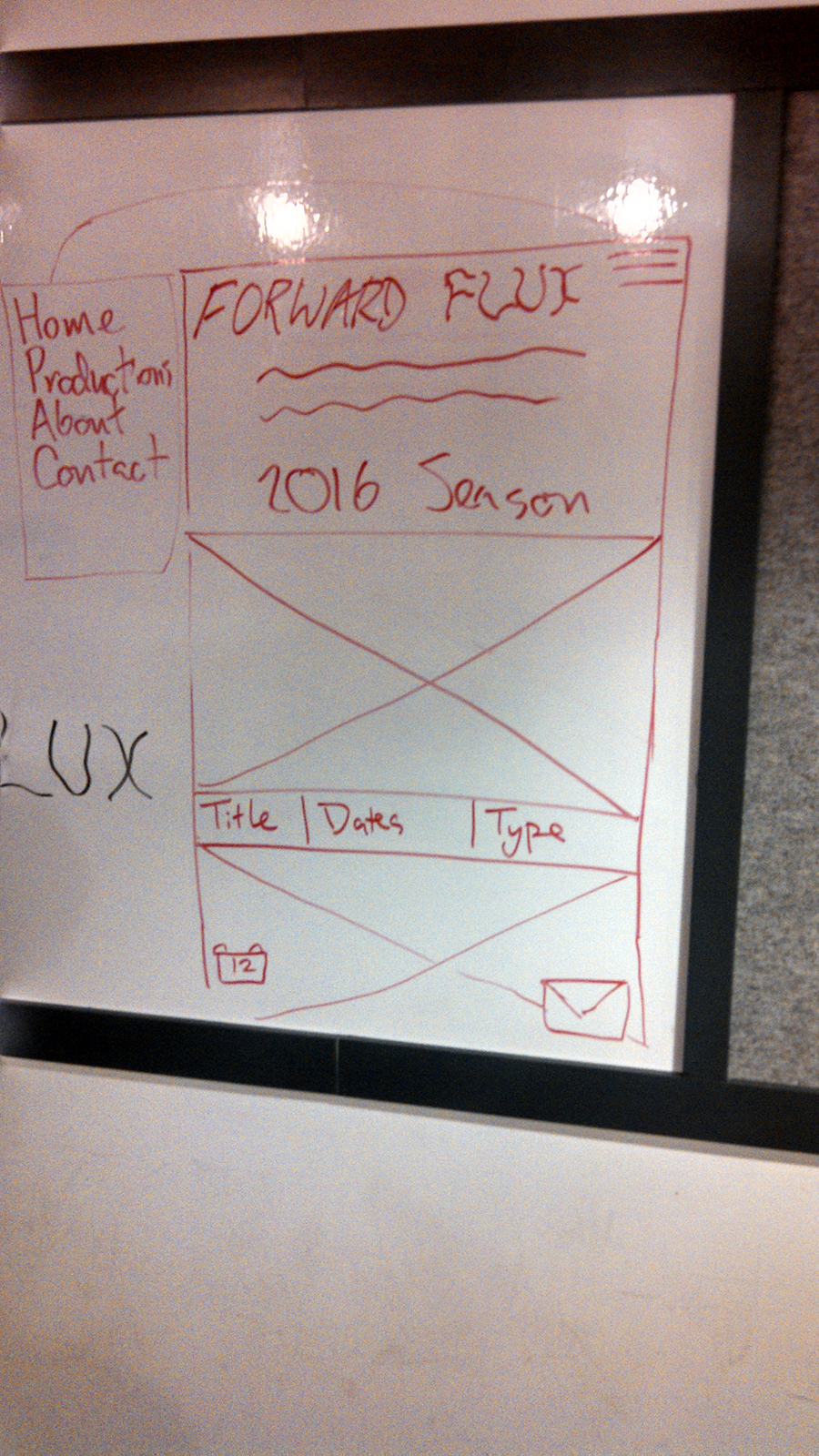
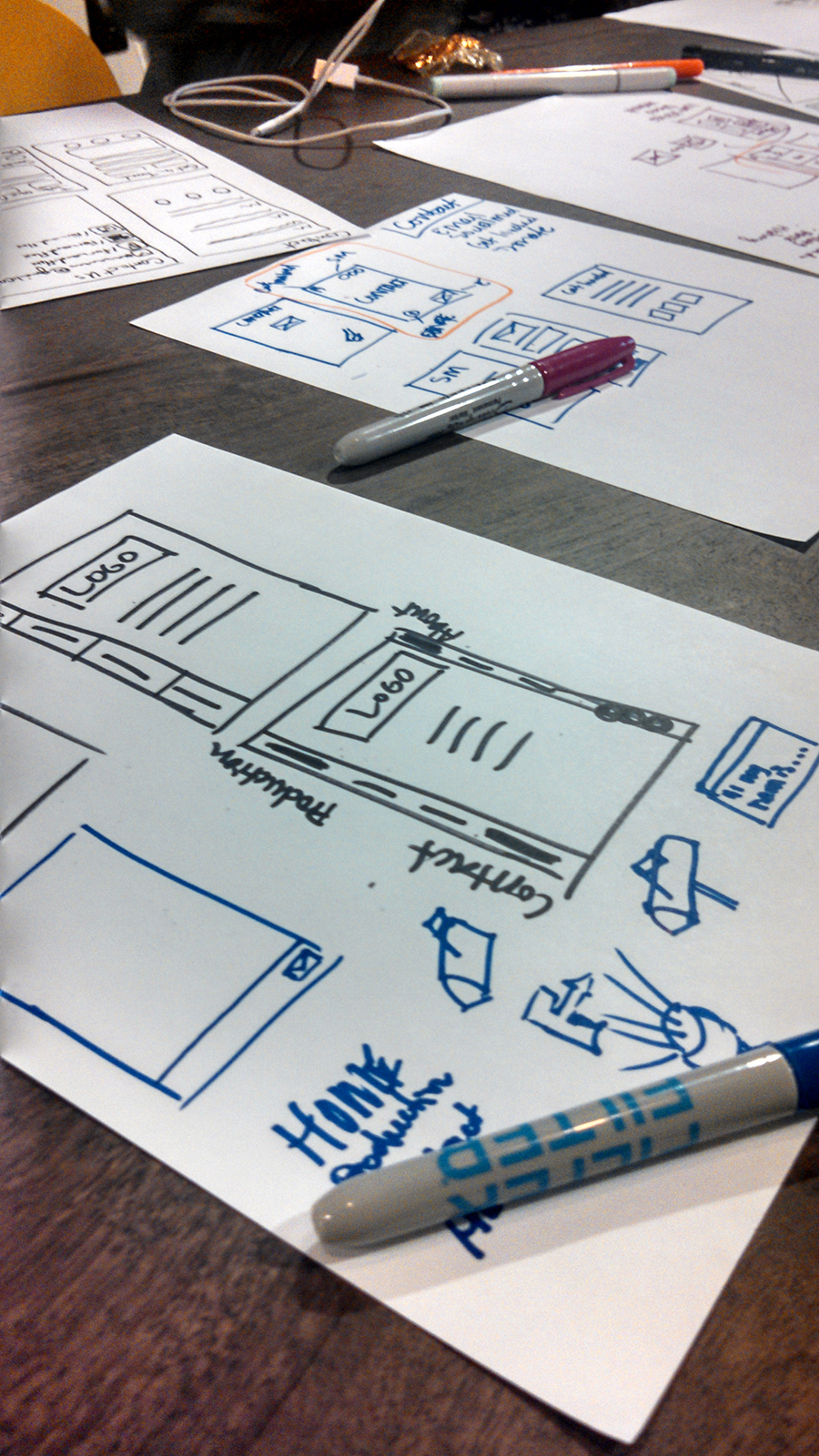
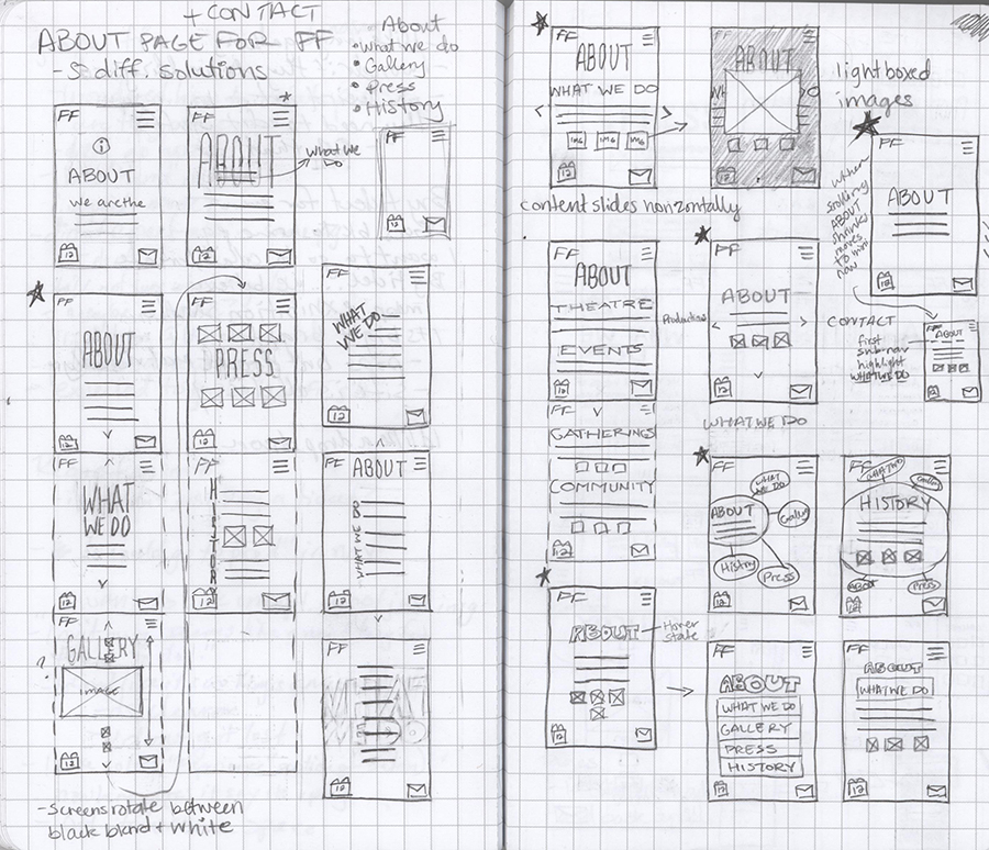
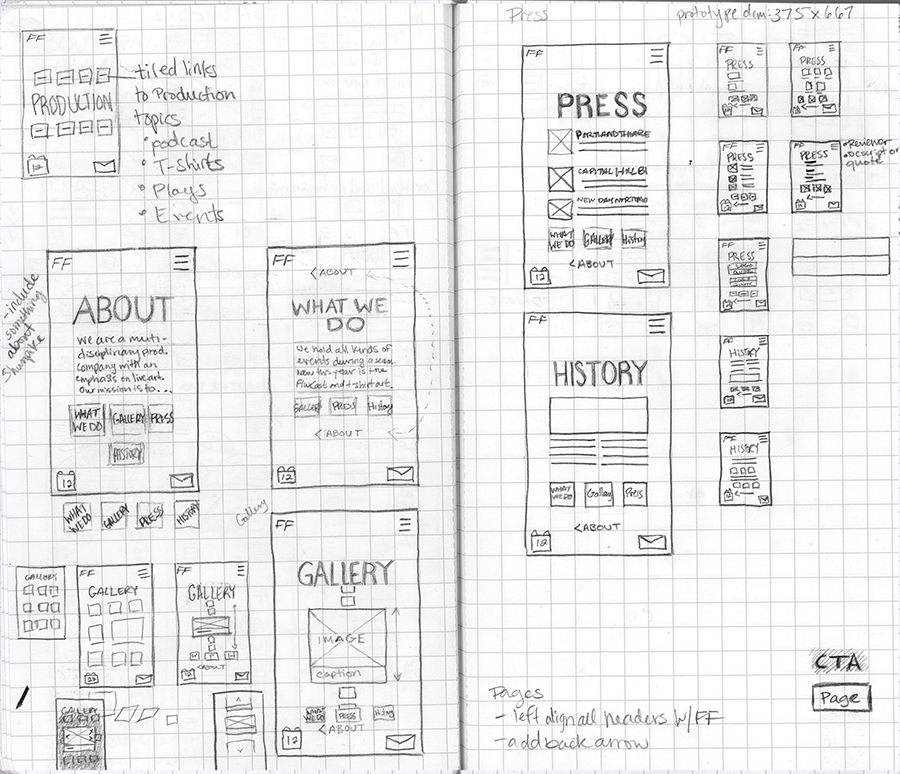
Sketching Simple and Experimental Designs
I focused on simple UI sketches to make sure the content was the driving force behind the layout.
Setting Visual Standards
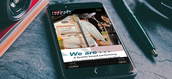
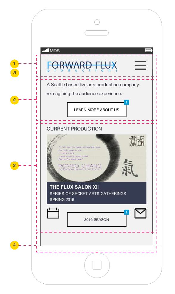
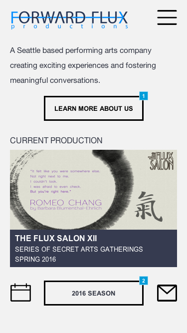
Design phase 1 - Using the existing Forward Flux visual aesthetic, we focused on setting standards to strengthen hierarchy and clarity of content. This phase is for immediate application to the current site.
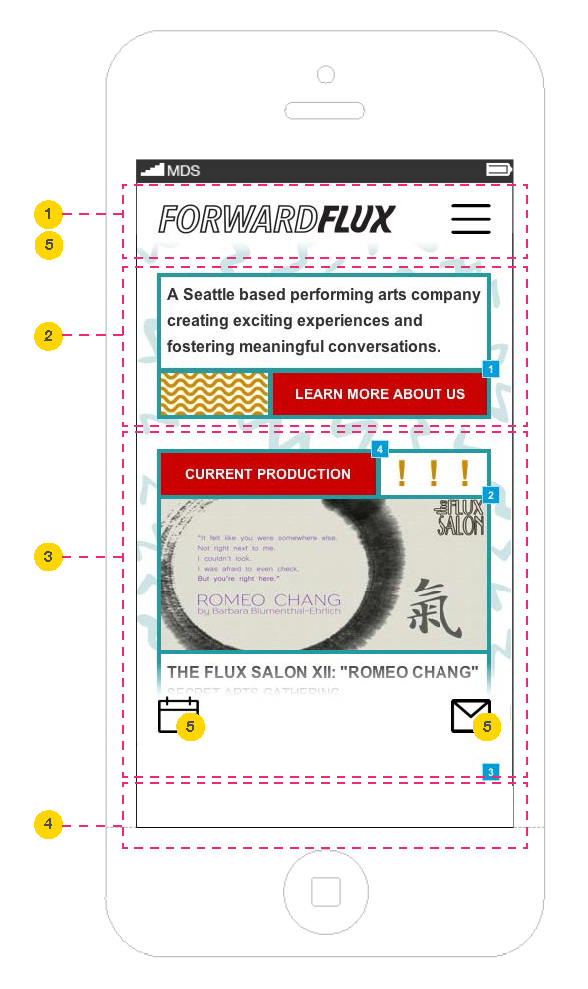
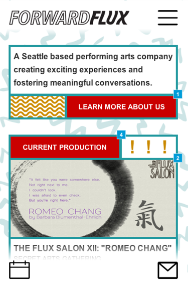
Design phase 2 - To appeal to audiences outside of theatre, we created a design aesthetic that attempted to address the "edgy" factor our stakeholder strived for. This phase was presented as a more long-term approach.
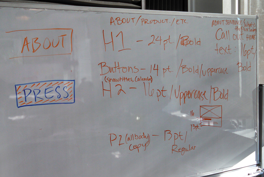
I expressed the need for visual standards that would help create a stronger design across the mobile application. These standards were also organized in a spec document provided for the client.
Important information included:
- The overall look of our strengthened AI and how it informed the UI layout
- How the Safari browser UI is considered in the layout of the mobile web app
- A detailed description of the interaction of the global navigation
- Our two visual design solutions created for immediate and long-term application
Our First Round of Testing
Giving Hierachy to the Existing Design
We tested our solution with users to determine if we solved the problem. What we learned:
- Users continued to have a difficult time understanding what the company does
- Completing the Flux Salon workflow was improving, but needed refinement
- Users had a better understanding of their location in the system
Previously:
"I want to know why I need to request an invitation. Without that I’m getting a little uncomfortable."
The Second Round of Testing
Refining and Exploring Alternative Visual Approaches
We revisited our first iteration prototype and determined that refining the language of the content was in order, to help users understand who Forward Flux was. We also implemented a significant visual departure from the current Forward Flux site, to test whether we could improve the "edgy" quality Wesley was seeking.
What We Learned
- On a scale of 1-5, we increased the trustworthiness of the site from 1.7 to 3.5
between the original and the redesign
- Our attempts at a different visual approach did not change the "edgy" factor we were striving for
- The content clarity was significantly improved
Improving Visual "Edginess"
Visual Contrast and Consistency
With a clear improvement in trustworthiness, I wanted to revisit the visual design of the app to more closely align Wesley's desire to be "edgy". This would:
- Build the next step in reaching newer audiences outside of theatre
- Create a unique presence for Forward Flux among competitors
- More clearly communicate the mission of the business
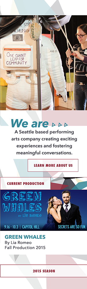
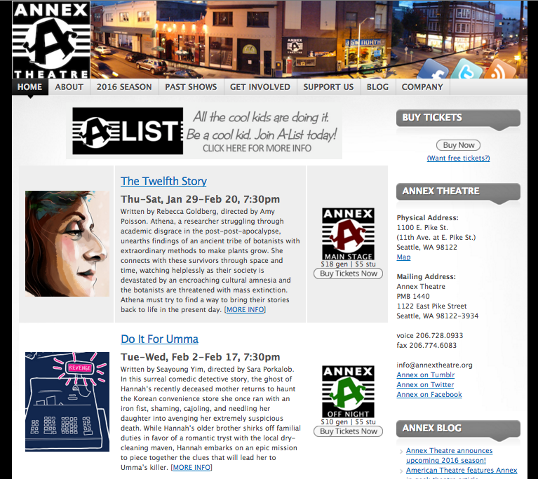
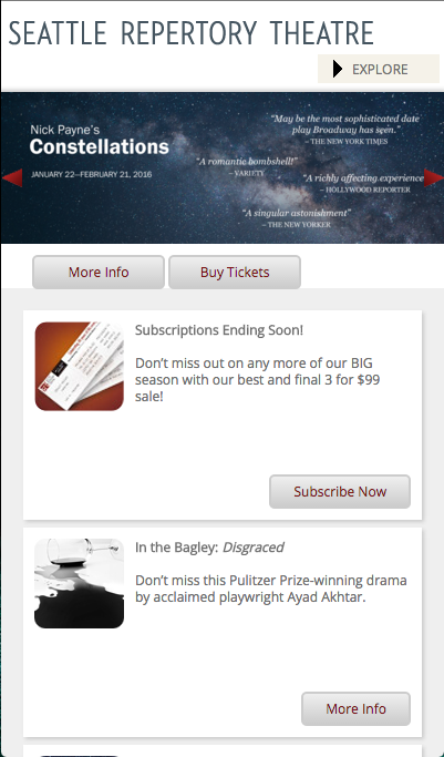
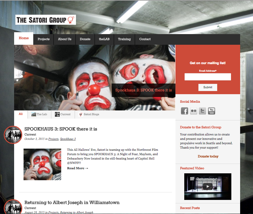
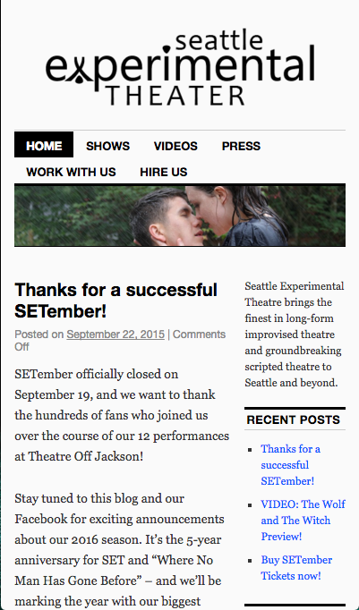
Competitors in Experimental Theatre
I researched the web and mobile presence of experimental theaters in Seattle. From my research, I found that The Annex Theatre and The Satori Group had sites that did not translate to mobile. The Seattle Experimental Theatre and and Seattle Repertory Theatre had responsive websites, but lacked a visual language that communicated their missions.
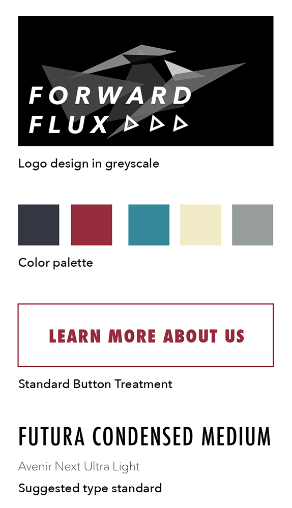
Forward Flux in Typography and Color
I studied the existing Forward Flux logo and branding to look at new ways to communicate Forward Flux's mission of creating conversation around contemporary topics not only through performance art, but fine art, music, apparel and new mediums like podcasts.
Original Forward Flux logo and branding
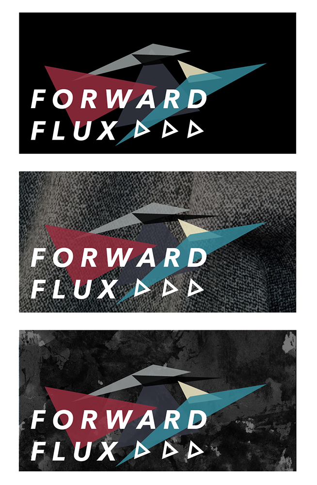
Revised logo and branding